carolinrauen_yello_01 carolinrauen_yello_02 carolinrauen_yello_03 carolinrauen_yello_04 carolinrauen_yello_05 carolinrauen_yello_06 carolinrauen_yello_07 carolinrauen_yello_08

Yello

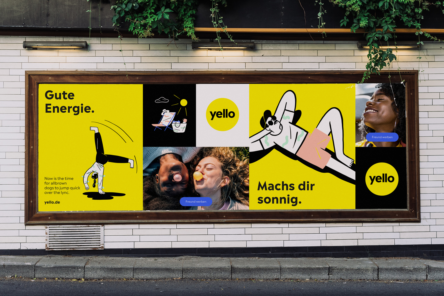
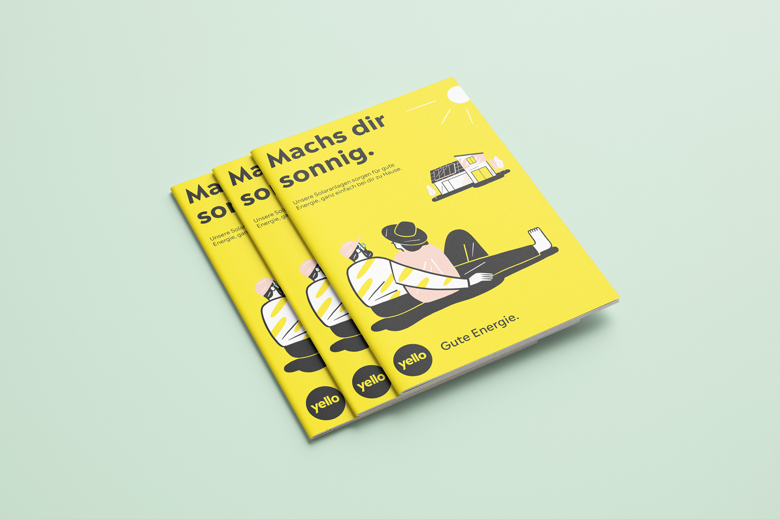
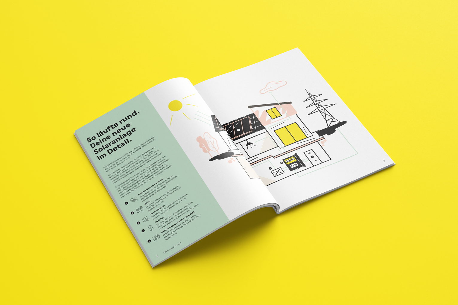
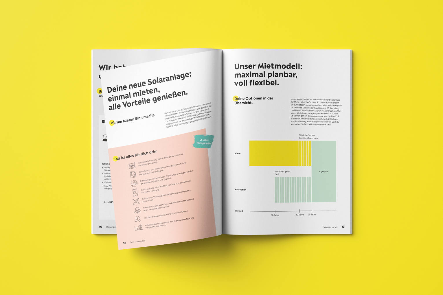
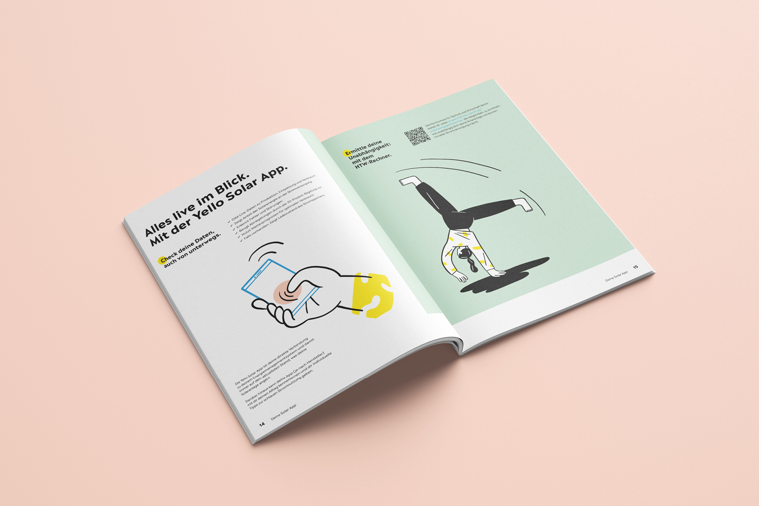
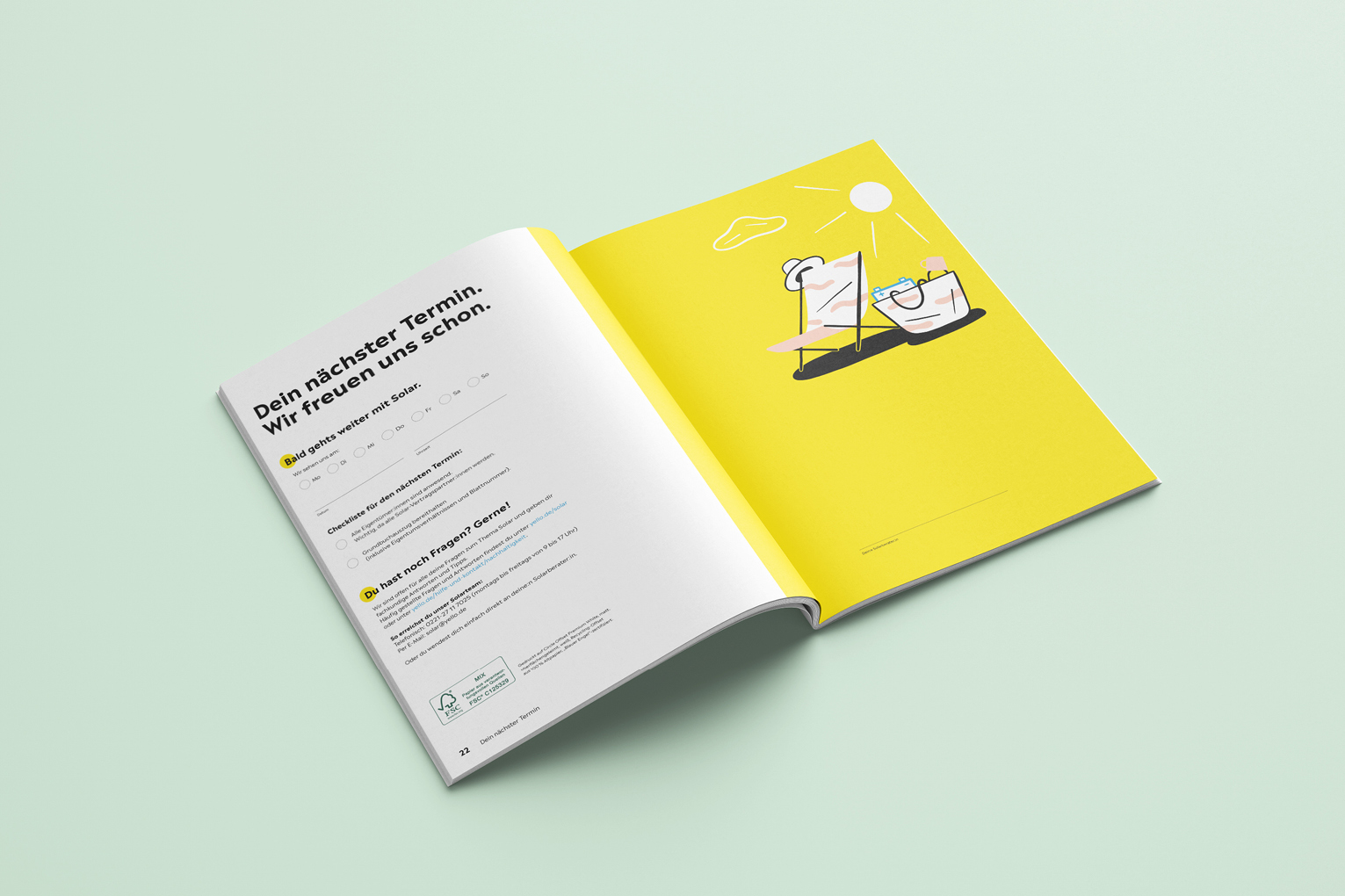
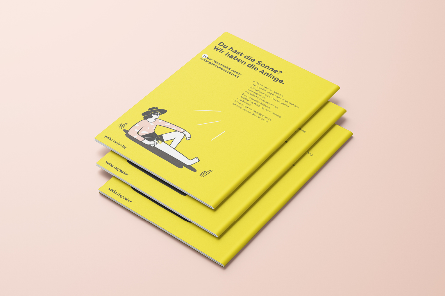
Fresh, light and full of energy – that’s Yello! As the first editorial project of the brand relaunch, the brochure conveys the change from an energy supplier to a source of inspiration for everyday life. On the color scale, strong yellow in combination with fresh mint and peach creates a summer feeling all year round. The light, hand-drawn illustrations by Veronika Kieneke bring fun, identification, even more energy and each one tells a story. This way, even figures and calculations are anything but boring.

carolinrauen_karinrocke_lookbook_edition21_7 carolinrauen_karinrocke_lookbook_edition21_8 carolinrauen_karinrocke_lookbook_edition21_3 carolinrauen_karinrocke_lookbook_edition21_2 carolinrauen_karinrocke_lookbook_edition21_5 carolinrauen_karinrocke_lookbook_edition21_4 carolinrauen_karinrocke_lookbook_edition21_6 carolinrauen_karinrocke_lookbook_edition21_9 carolinrauen_karinrocke_lookbook_edition21_10 carolinrauen_karinrocke_lookbook_edition21_11 carolinrauen_karinrocke_lookbook_edition21_1

Karin Rocke: Edition 2021

“A small number of fine things” is the title of Karin Rocke’s Edition 2021. Romantic coloring and masculine elements mix to an extraordinary tension. The color scale ranges from soft lemon and rusty coral to milky white and deep navy. These beautiful tones come back in soft gradients in the layout to stress the connection to the pictures. Welcome, summer!

carolinrauen_dpa_newnormal_3 carolinrauen_dpa_newnormal_2 carolinrauen_dpa_newnormal_5 carolinrauen_dpa_newnormal_6 carolinrauen_dpa_newnormal_7 carolinrauen_dpa_newnormal_8 carolinrauen_dpa_newnormal_9 carolinrauen_dpa_newnormal_1 carolinrauen_dpa_newnormal_10 carolinrauen_dpa_newnormal_11 carolinrauen_dpa_newnormal_12 carolinrauen_dpa_newnormal_13 carolinrauen_dpa_newnormal_14

New Normal

The whitepaper “New Normal” offers a big number of insights about current changes in the working environment and in the brand communication. Covid speeds up the changing processes, that already started before. Besides articles about future communication planning, challenges of home office and learnings from the lock down, you find several interviews by renowned experts in a new colorful layout that consciously takes up and adapts elements of our new digital everyday life.

carolinrauen_karinrocke_winter17_1 carolinrauen_karinrocke_winter17_2 carolinrauen_karinrocke_winter17_3 carolinrauen_karinrocke_winter17_4 carolinrauen_karinrocke_winter17_5 carolinrauen_karinrocke_winter17_7 carolinrauen_karinrocke_winter17_6

Karin Rocke: Autum/Winter 2017/2018

“Clean Lines” is the title of the latest collection by Karin Rocke: The pieces impress with their striking silhouettes, graphic elements and strong colors as well as exquisite materials that only unfold their full sense of well-being on your skin. The key colors, a soft cherry blossom pink and a rich ruby red, frame the collection – as do the colored geometric fields behind and around the photographs, which give the paper an architectural dimension.

for Karin Rocke
editorial design
lookbook
148 x 210 mm
digital printing
2017

carolinrauen_xtra_3 carolinrauen_xtra_1 carolinrauen_xtra_2 carolinrauen_xtra_4 carolinrauen_xtra_5 carolinrauen_xtra_6 carolinrauen_xtra_7 carolinrauen_xtra_8 carolinrauen_xtra_9 carolinrauen_xtra_10 carolinrauen_xtra_11 carolinrauen_xtra_12 carolinrauen_xtra_13 carolinrauen_xtra_14 carolinrauen_xtra_15 carolinrauen_xtra_16

xtra

xtra presents current topics from laboratories and clinics, it informs about new technologies to discover diseases more quickly and heal them more efficiently. Inside you find a colourful mix of reports, essays, professional articles and facts and figures. The redesigned issue no. 2/2019 conveys precisely this successful type of science communication with plenty of white space, a clear structure and typography, high-quality photographs and impressive information graphics.