Carolin Rauen: Katharina Gschwendtner #1 Carolin Rauen: Katharina Gschwendtner #10 Carolin Rauen: Katharina Gschwendtner #12 Carolin Rauen: Katharina Gschwendtner #13 Carolin Rauen: Katharina Gschwendtner #14 Carolin Rauen: Katharina Gschwendtner #15 Carolin Rauen: Katharina Gschwendtner #16 Carolin Rauen: Katharina Gschwendtner #17 Carolin Rauen: Katharina Gschwendtner #2 Carolin Rauen: Katharina Gschwendtner #3 Carolin Rauen: Katharina Gschwendtner #4 Carolin Rauen: Katharina Gschwendtner #5 Carolin Rauen: Katharina Gschwendtner #6 Carolin Rauen: Katharina Gschwendtner #7 Carolin Rauen: Katharina Gschwendtner #8 Carolin Rauen: Katharina Gschwendtner #9

Katharina Gschwendtner: Portfolio

Katharina Gschwendtner is an illustrator and painter from Hamburg. The line is her base, for her it can do anything. In her portfolio the line is the base for the design, too: Headlines are set in outlines, Texts are separated from the images by a line, the characteristic of the font is a constant line stroke. The appearance is resolut, but never superficial. Every element finds its place to spread ideas and fun.

carolinrauen_karinrocke_winter17_1 carolinrauen_karinrocke_winter17_2 carolinrauen_karinrocke_winter17_3 carolinrauen_karinrocke_winter17_4 carolinrauen_karinrocke_winter17_5 carolinrauen_karinrocke_winter17_7 carolinrauen_karinrocke_winter17_6

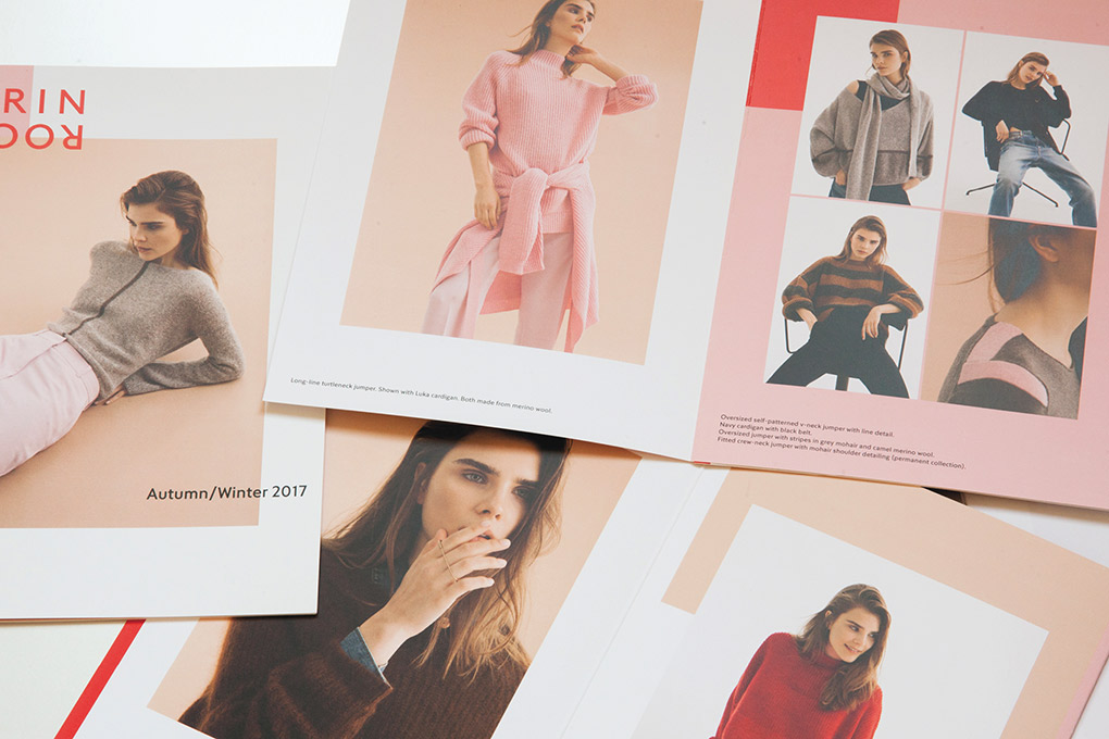
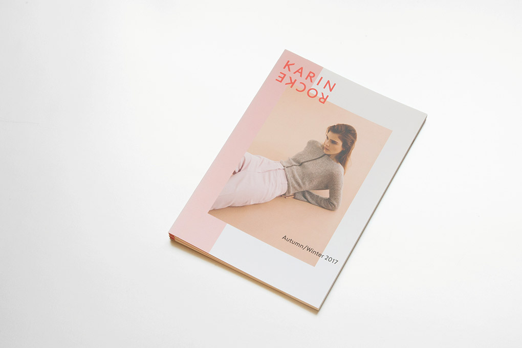
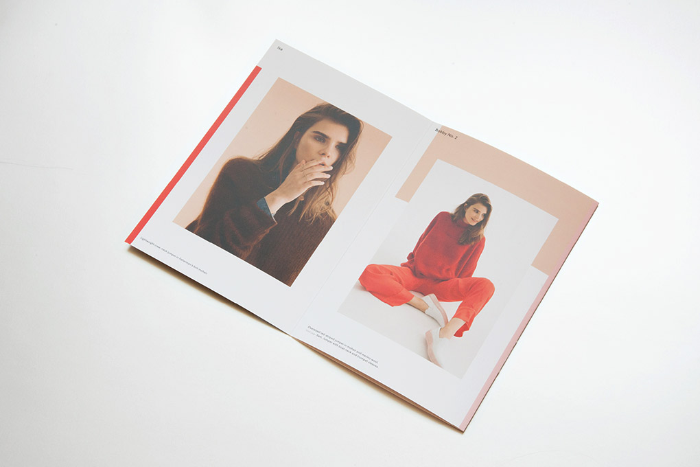
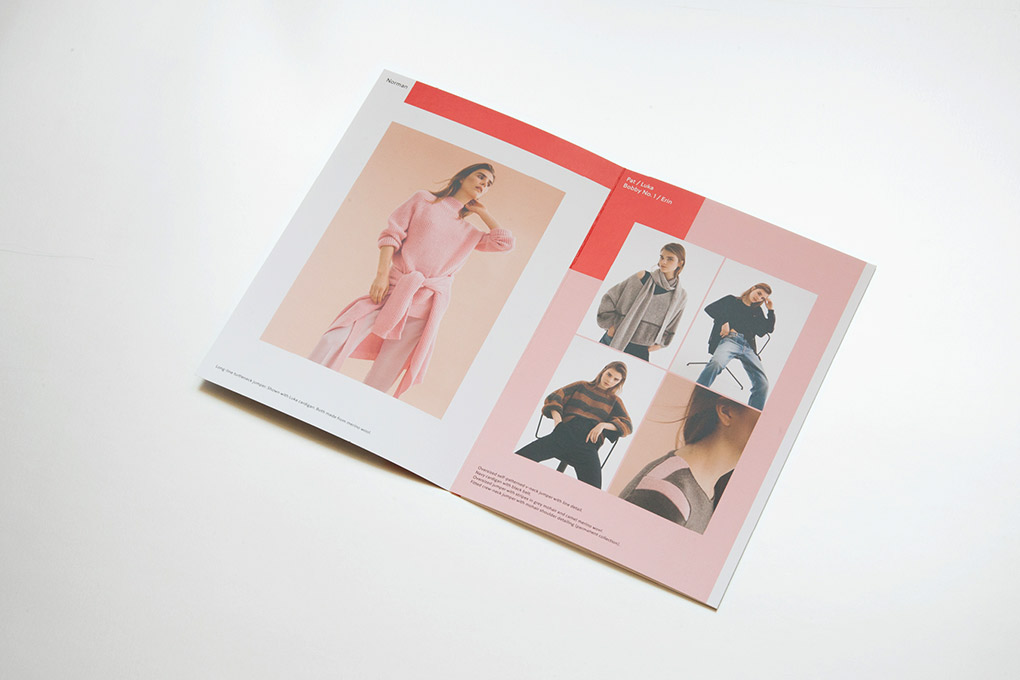
Karin Rocke: Autum/Winter 2017/2018

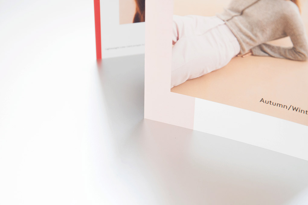
“Clean Lines” is the title of the latest collection by Karin Rocke: The pieces impress with their striking silhouettes, graphic elements and strong colors as well as exquisite materials that only unfold their full sense of well-being on your skin. The key colors, a soft cherry blossom pink and a rich ruby red, frame the collection – as do the colored geometric fields behind and around the photographs, which give the paper an architectural dimension.

for Karin Rocke
editorial design
lookbook
148 x 210 mm
digital printing
2017

carolinrauen_shootingstars15_001 carolinrauen_shootingstars15_002 carolinrauen_shootingstars15_003 carolinrauen_shootingstars15_004 carolinrauen_shootingstars15_005 carolinrauen_shootingstars15_006 carolinrauen_shootingstars15_007 carolinrauen_shootingstars15_008 carolinrauen_shootingstars15_009 carolinrauen_shootingstars15_010 carolinrauen_shootingstars15_011 carolinrauen_shootingstars15_012 carolinrauen_shootingstars15_013 carolinrauen_shootingstars15_014 carolinrauen_shootingstars15_015 carolinrauen_shootingstars15_016 carolinrauen_shootingstars15_017

European Shooting Stars 2015

The „European Shooting Stars“ are the ten best up-and-coming actors from Europe, chosen by a jury of experts, nominated by the member organizations of European Film Promotion. The magazine adopts the glamourous look of the award ceremony by black-and-white photographs and elegant typography. It catches attention by the strong red colour. The rough paper and the diverse layout reflect the actors’ unadapted strong characters.

carolinrauen_porsche_001 carolinrauen_porsche_002 carolinrauen_porsche_003 carolinrauen_porsche_004 carolinrauen_porsche_05 carolinrauen_porsche_06 carolinrauen_porsche_07 carolinrauen_porsche_08 carolinrauen_porsche_09 carolinrauen_porsche_10 carolinrauen_porsche_11 carolinrauen_porsche_12 carolinrauen_porsche_13 carolinrauen_porsche_14 carolinrauen_porsche_15 carolinrauen_porsche_16 carolinrauen_porsche_17 carolinrauen_porsche_18

Porsche Annual Report

People all over the world recognize a Porsche car simply by its distinctive shape and the sound of its engine. The quality is undeniable, you don’t have to explain why you choose a Porsche. – “Performance needs no words.” – Therefore the annual report almost foregoes text and transports the Porsche feeling through strong images. Elegance, lightness, speed, precision, big emotions… You almost feel like you are on the road yourself.

carolinrauen_greenpeace_01 carolinrauen_greenpeace_02 carolinrauen_greenpeace_03 carolinrauen_greenpeace_04 carolinrauen_greenpeace_05 carolinrauen_greenpeace_06 carolinrauen_greenpeace_07 carolinrauen_greenpeace_08

Greenpeace

Based on the basic color and typographic specifications from Greenpeace International, we revised the visual appearance of Greenpeace Germany. We called our concept “Make it big” – with large images and headlines that create a uniform and contemporary appearance that objectively but emotionally reflects the Greenpeace-typical character of the campaign.