Good design is clear, concise and tangible. Through my design, your content becomes visible, accessible and comprehensible. Thanks to the finely tuned tonality, they reach the viewer not only cognitively, but also emotionally. And thus anchor themselves in the long term and sustainably.
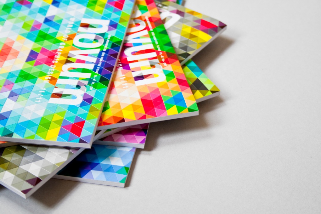
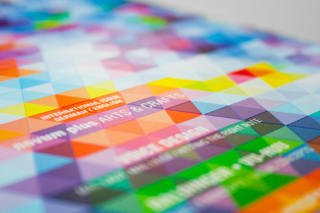
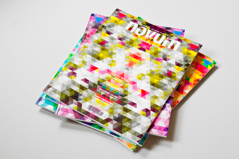
Tell me about your project

carolinrauen_novum_001 carolinrauen_novum_002 carolinrauen_novum_003 carolinrauen_novum_004 carolinrauen_novum_005 carolinrauen_novum_006 carolinrauen_novum_007 carolinrauen_novum_008 carolinrauen_novum_009 carolinrauen_novum_010 carolinrauen_novum_011 carolinrauen_novum_012 carolinrauen_novum_013 carolinrauen_novum_014 carolinrauen_novum_015 carolinrauen_novum_016 carolinrauen_novum_017

Novum

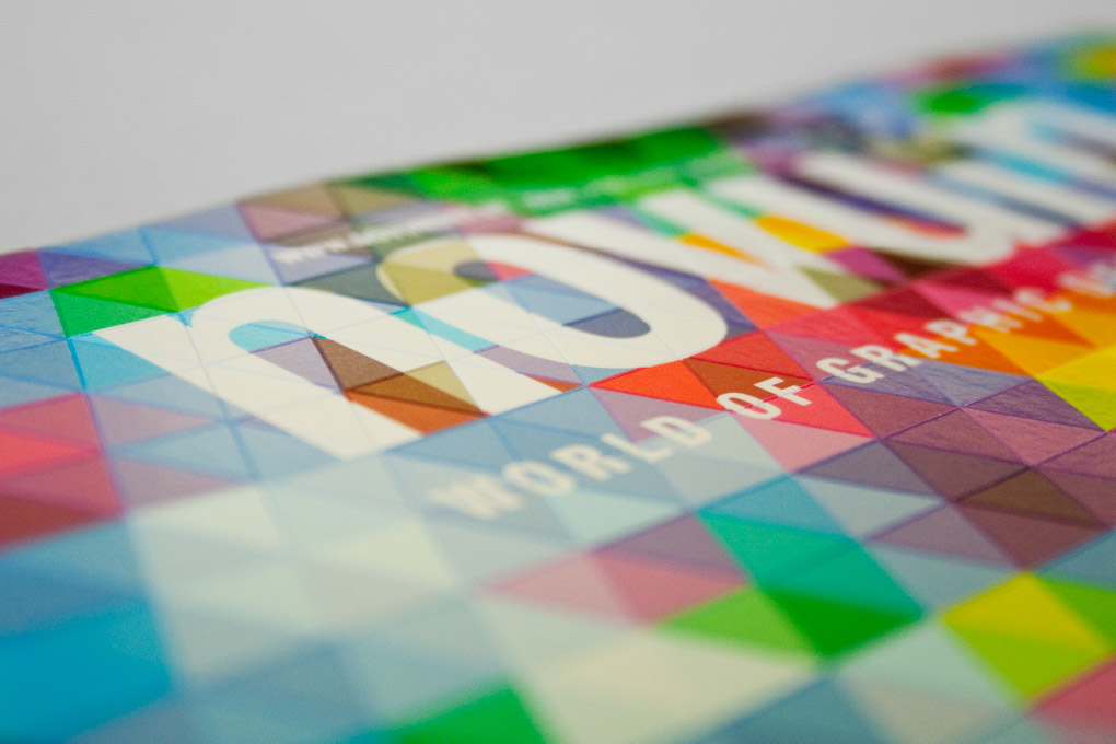
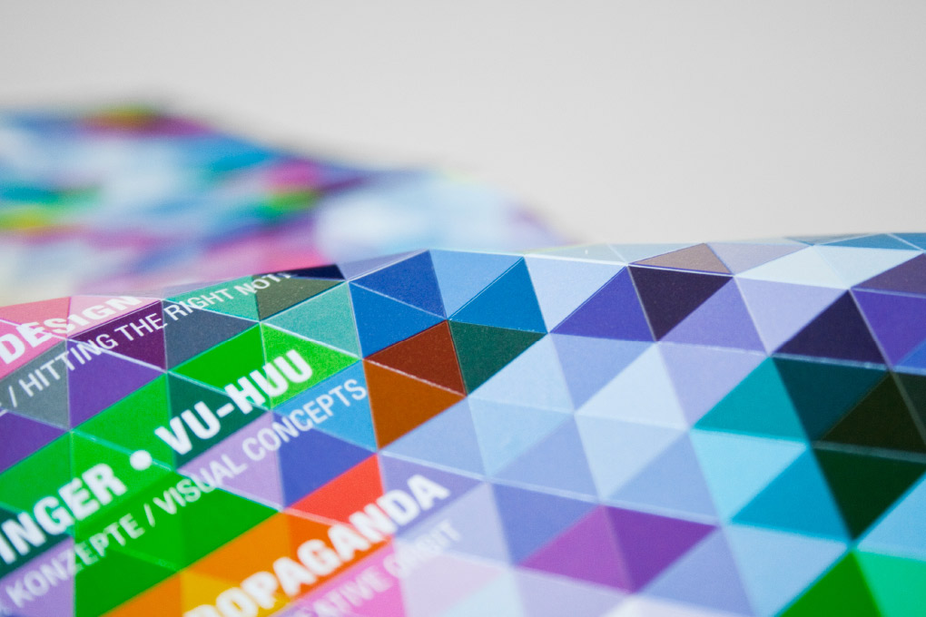
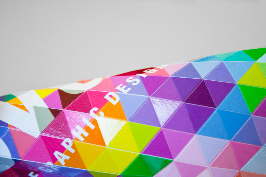
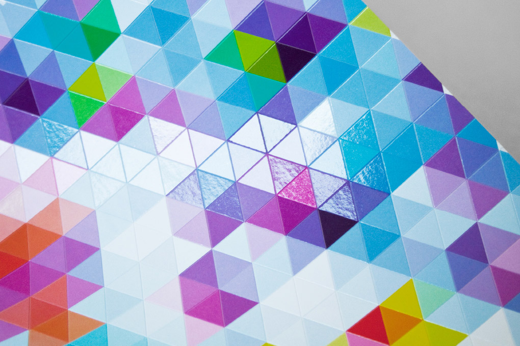
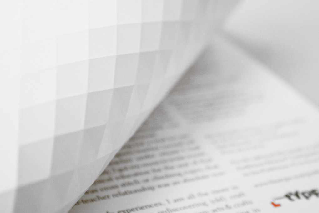
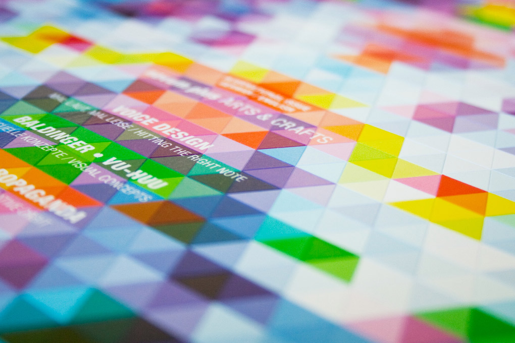
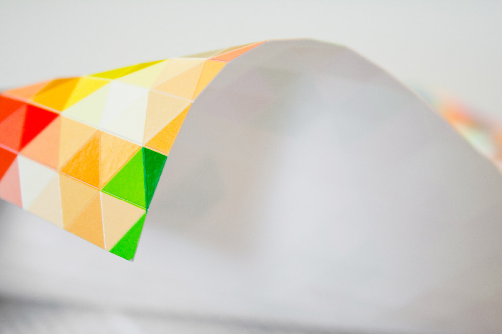
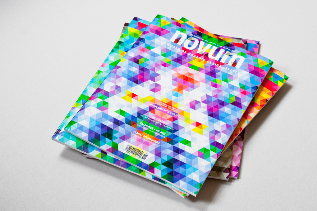
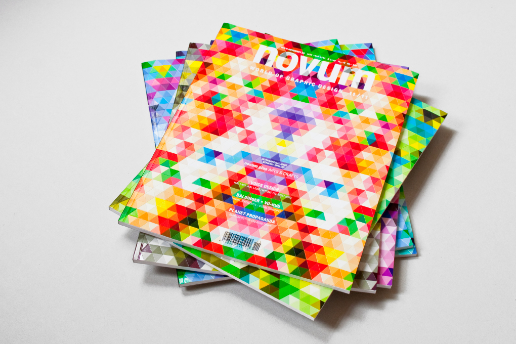
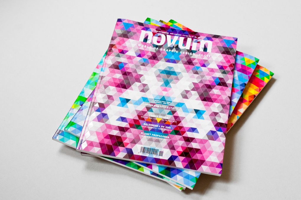
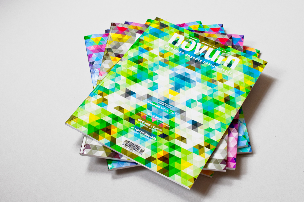
A magazine cover can be more than a glossy picture: 1,300 colorful equilateral triangles, each cover cut by 104 blades. This makes the paper flexible, you can fold it in all directions and create three-dimensional shapes. The light is reflected like on a diamond, and the movements can even produce sounds. So that everyone can choose their favorite color, we printed six versions – with just one set of printing plates.

carolinrauen_greenpeace_01 carolinrauen_greenpeace_02 carolinrauen_greenpeace_03 carolinrauen_greenpeace_04 carolinrauen_greenpeace_05 carolinrauen_greenpeace_06 carolinrauen_greenpeace_07 carolinrauen_greenpeace_08

Greenpeace

Based on the basic color and typographic specifications from Greenpeace International, we revised the visual appearance of Greenpeace Germany. We called our concept “Make it big” – with large images and headlines that create a uniform and contemporary appearance that objectively but emotionally reflects the Greenpeace-typical character of the campaign.