Good design is clear, concise and tangible. Through my design, your content becomes visible, accessible and comprehensible. Thanks to the finely tuned tonality, they reach the viewer not only cognitively, but also emotionally. And thus anchor themselves in the long term and sustainably. Tell me about your project.


Iris Anemone Paul
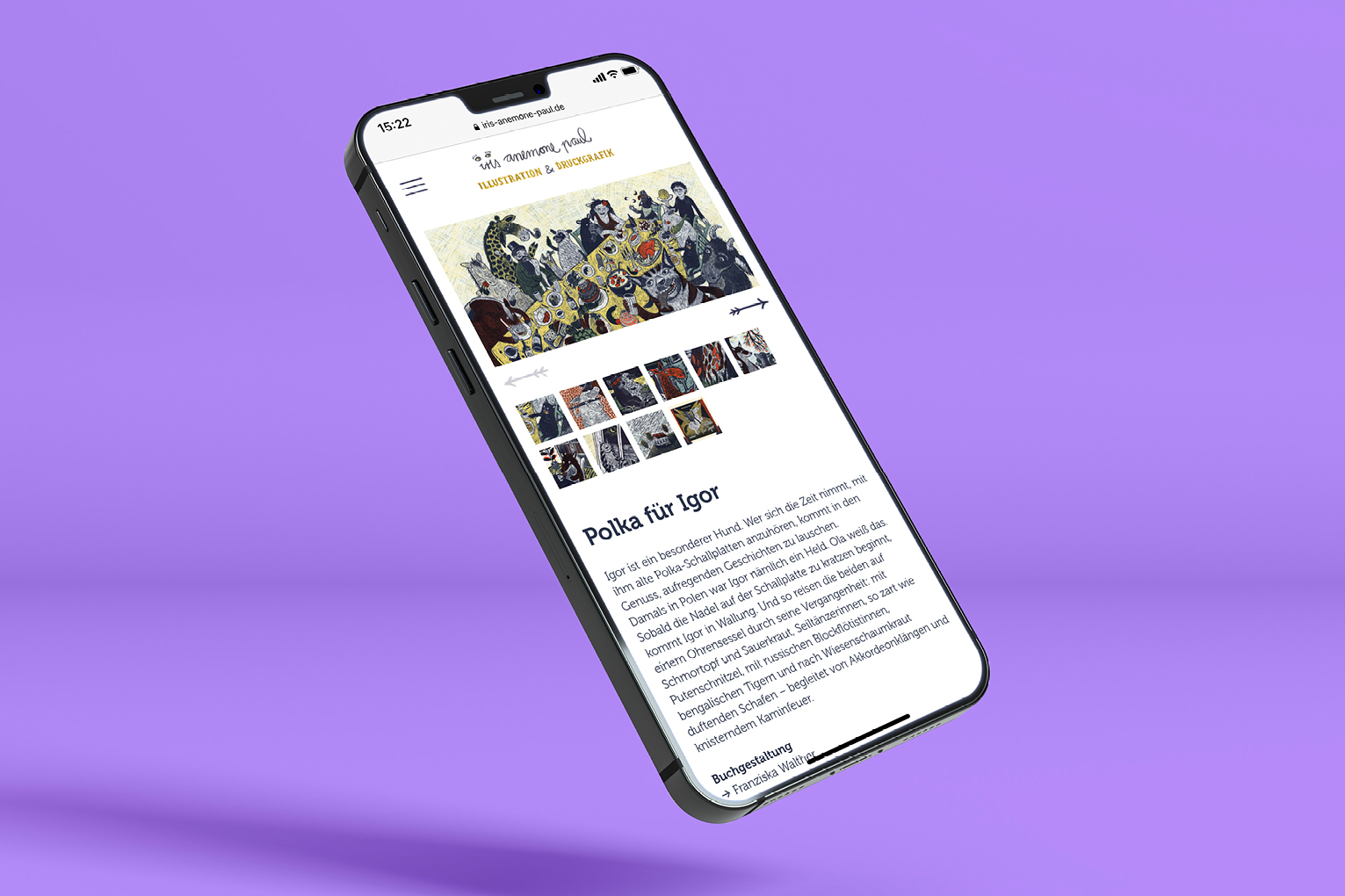
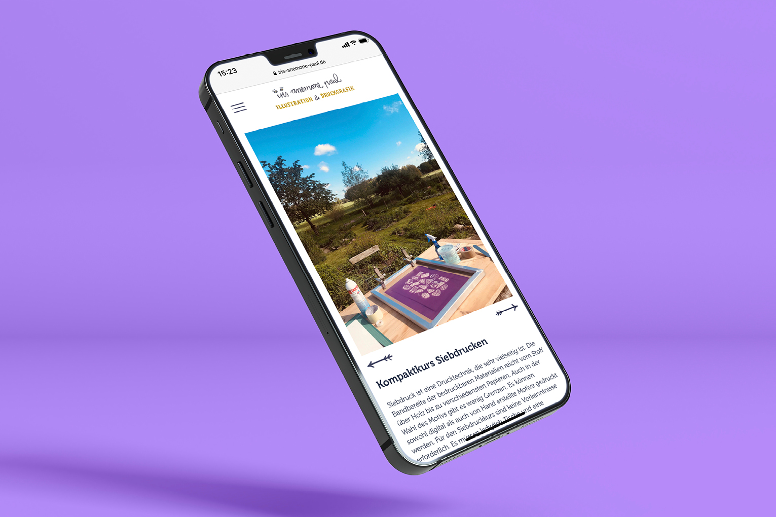
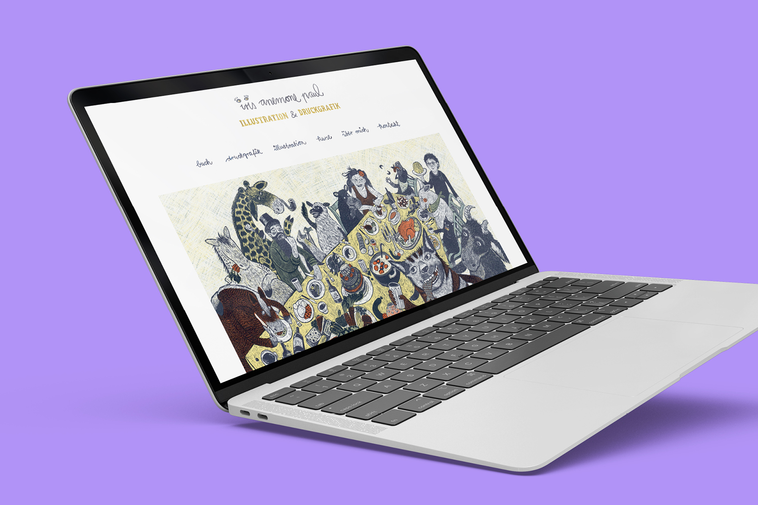
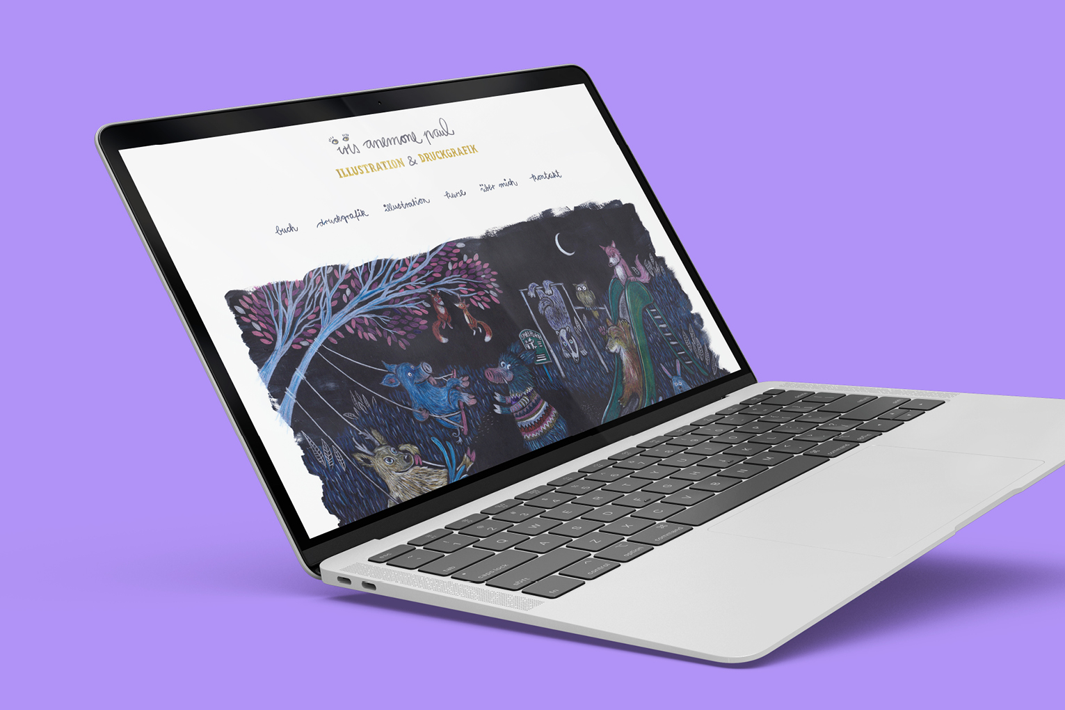
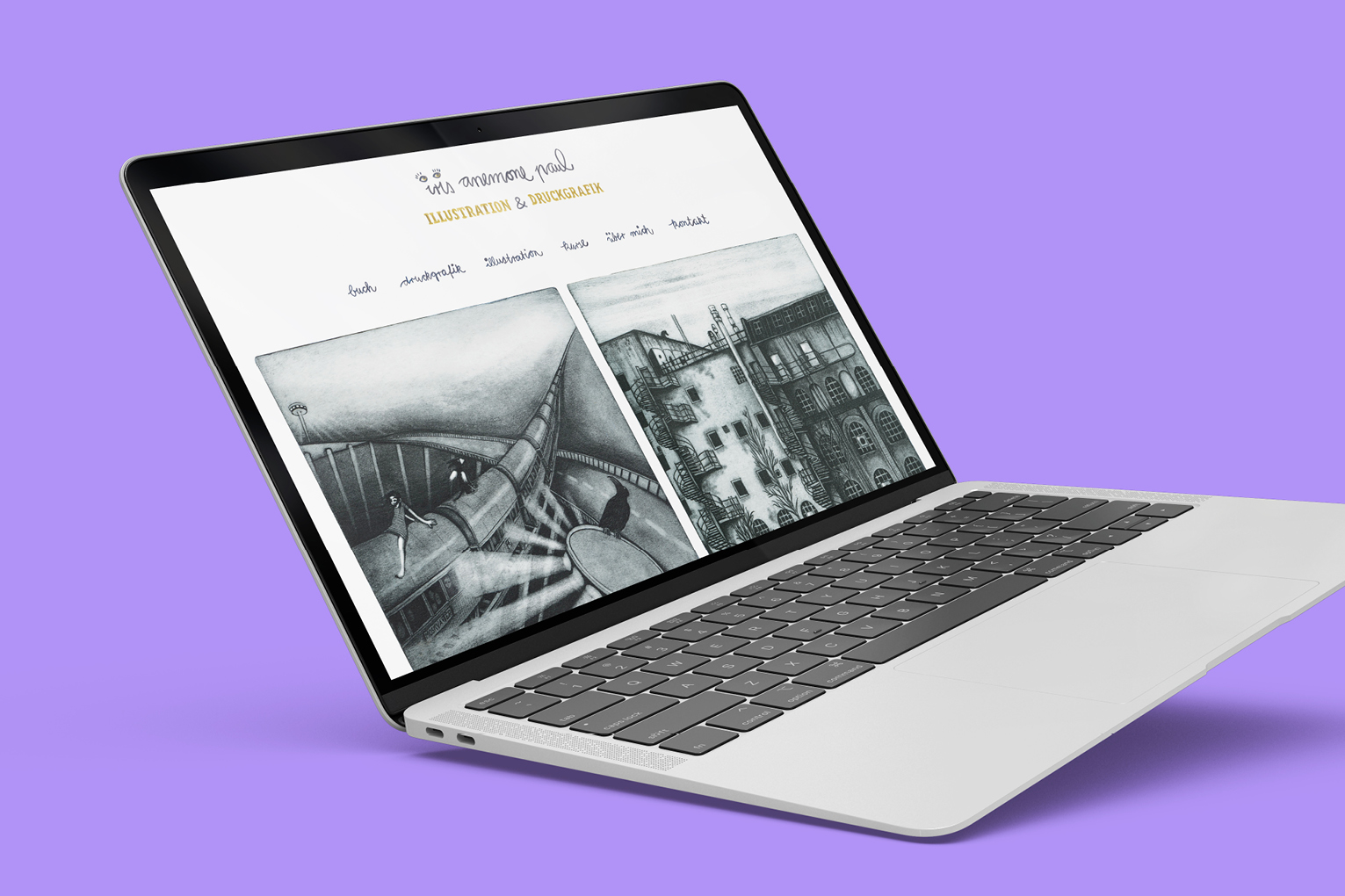
Iris Anemone Paul is an illustrator based in Hamburg. With a focus on graphic reproduction techniques like silk-screen printing, woodcarving and etching, Iris creates lovely, playful and warm sceneries for her characters and narratives. Thanks to numerous details – a small animation here, hand-drawn elements there – this atmosphere can also be felt on her website.