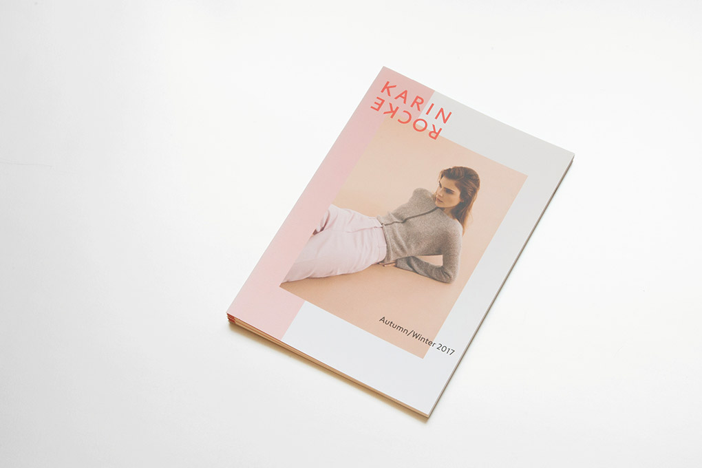
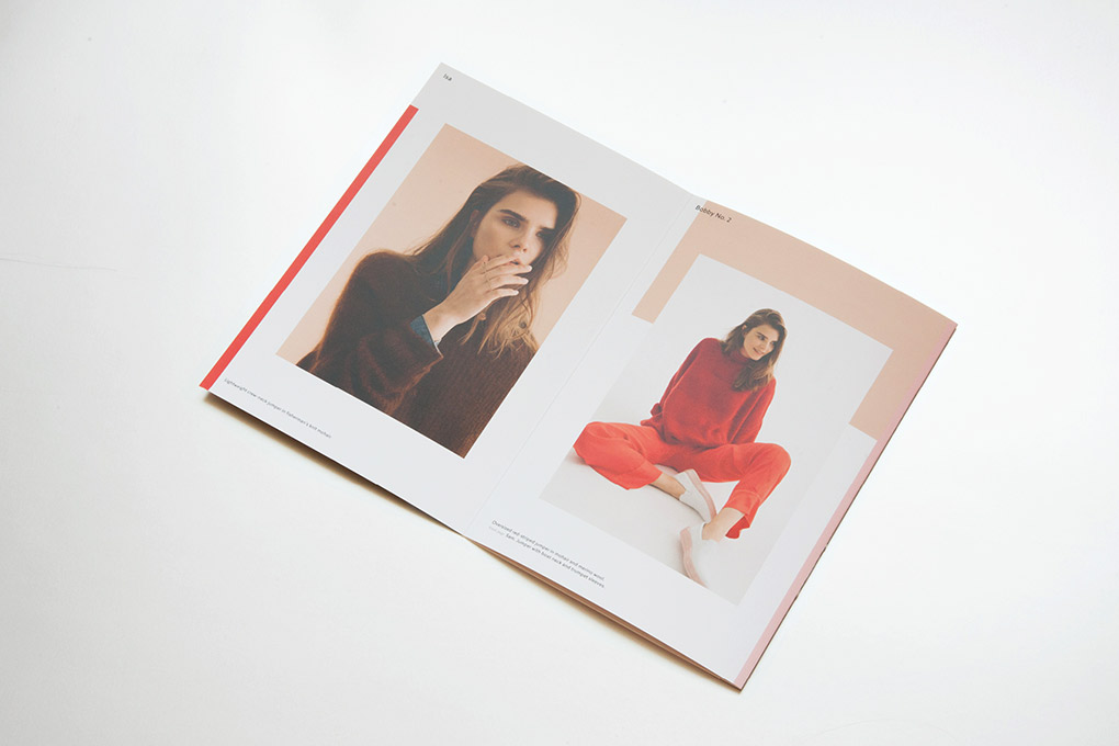
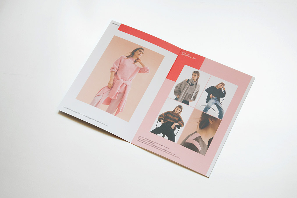
Good design is clear, concise and tangible. Through my design, your content becomes visible, accessible and comprehensible. Thanks to the finely tuned tonality, they reach the viewer not only cognitively, but also emotionally. And thus anchor themselves in the long term and sustainably.
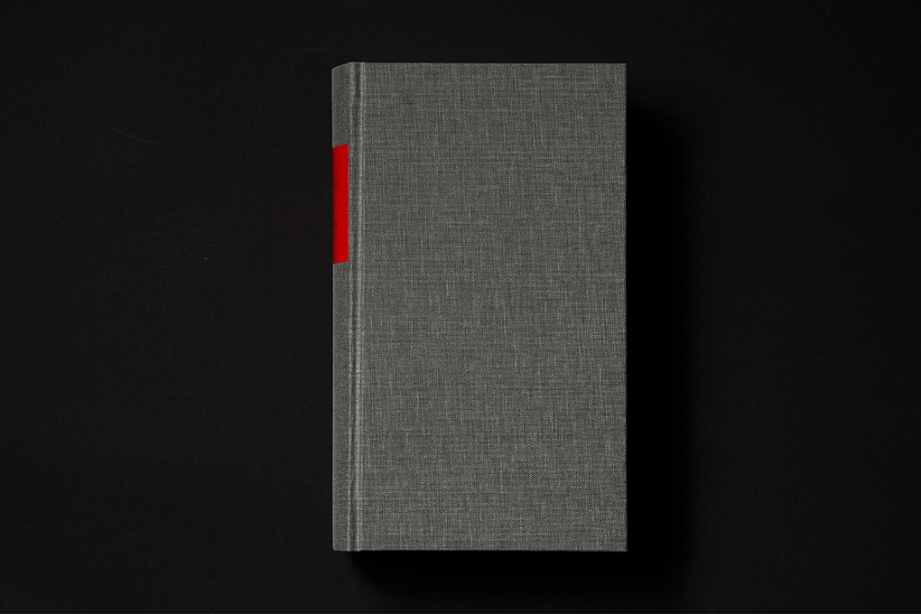
Tell me about your project

carolinrauen_verlorenermorgen_01 carolinrauen_verlorenermorgen_02 carolinrauen_verlorenermorgen_03 carolinrauen_verlorenermorgen_04 carolinrauen_verlorenermorgen_05 carolinrauen_verlorenermorgen_06 carolinrauen_verlorenermorgen_07 carolinrauen_verlorenermorgen_08 carolinrauen_verlorenermorgen_09 carolinrauen_verlorenermorgen_10

Verlorener Morgen

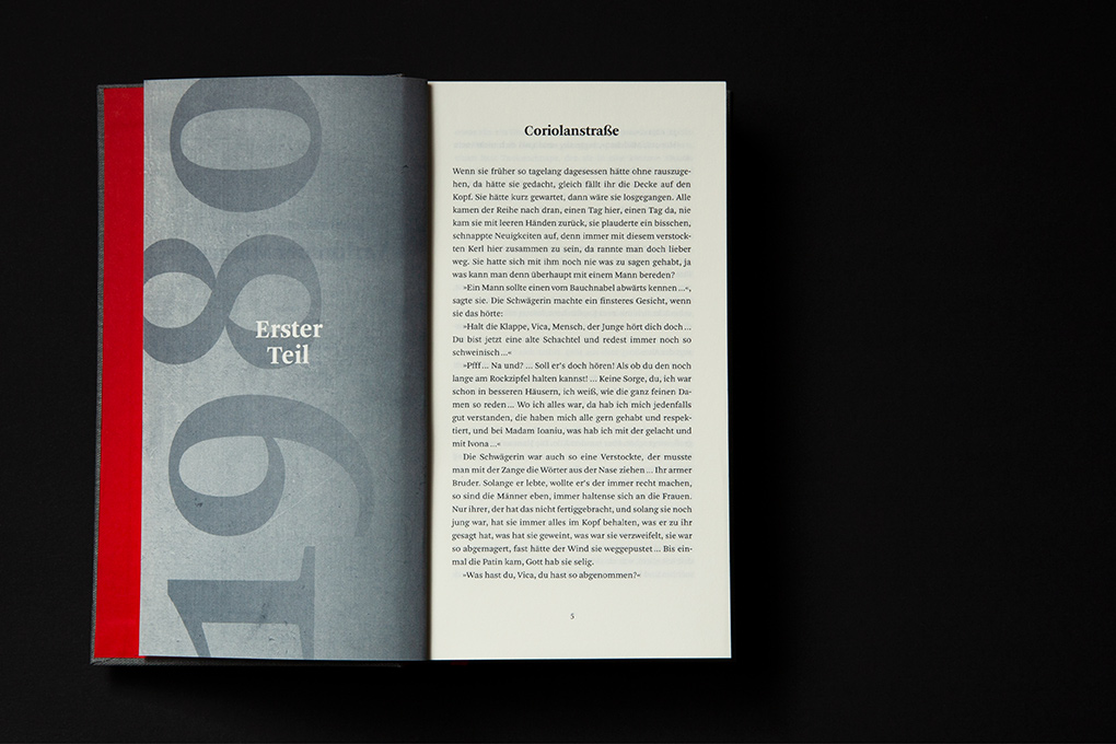
“Verlorener Morgen” is a novel about a whole country: Romania. It’s history is marked by suffering in many different ways and decades, the book concentrates on the World War I and the 1980s. But the protagonists are strong, especially the women. This strength becomes almost tangible in the form of three strong and impasto stripes of color – the Romanian flag – which cover up the gray reality in the photo behind.

carolinrauen_ziegel#16_4 carolinrauen_ziegel#16_6 carolinrauen_ziegel#16_7 carolinrauen_ziegel#16_8 carolinrauen_ziegel#16_9 carolinrauen_ziegel#16_10 carolinrauen_ziegel#16_11 carolinrauen_ziegel#16_12 carolinrauen_ziegel#16_13 carolinrauen_ziegel#16_14 carolinrauen_ziegel#16_15 carolinrauen_ziegel#16_17 carolinrauen_ziegel#16_16 carolinrauen_ziegel#16_19 carolinrauen_ziegel#16_18 carolinrauen_ziegel#16_20

Ziegel #16

A large shiny field of orange-red metallic hot foil reflects the light. Inside, bold, almost tapering letters form the word “brick”. Above, an angry, panting wolf. The first edition of the newly designed Hamburg yearbook for literature brings together poetry and fiction by almost fifty Hamburg authors as well as illustrations by Line Hoven. The book – whether cover or spine – attracts attention and makes you curious to look inside and lose yourself in the various texts.

for mairisch Verlag
book design
155 × 215 mm
hard cover, offset printing, metallic hot foil stamping
2019

carolinrauen_koenig&bauer_1 carolinrauen_koenig&bauer_2 carolinrauen_koenig&bauer_3 carolinrauen_koenig&bauer_4 carolinrauen_koenig&bauer_5 carolinrauen_koenig&bauer_6 carolinrauen_koenig&bauer_7 carolinrauen_koenig&bauer_8 carolinrauen_koenig&bauer_9 carolinrauen_koenig&bauer_10 carolinrauen_koenig&bauer_11 carolinrauen_koenig&bauer_12 carolinrauen_koenig&bauer_13 carolinrauen_koenig&bauer_14 carolinrauen_koenig&bauer_15 carolinrauen_koenig&bauer_16 carolinrauen_koenig&bauer_17 carolinrauen_koenig&bauer_18 carolinrauen_koenig&bauer_19 carolinrauen_koenig&bauer_20

Koenig & Bauer: Menschen, Maschinen & Ideen

200 years ago the founders of Koenig & Bauer invented the first printing machine driven by a steam engine. On behalve of this anniversary a box including a book, a bookazine and 13 posters tell the story from the past to the future – from technical but also very personal perspectives. “Menschen”, “Maschinen” and “Ideen” proove that innovation can result from tradition.

for Koenig&Bauer
with/at Mutabor & Grauel Publishing
book design, editorial design, packaging design, illustration
360 x 280 mm/180 x 240 mm/120 x 170 mm
offset printing, silkscreen printing
2017

4 × Red Dot Award: Communication Design 2018
3 × BCM Best of Content Marketing 2018
2 × ADC Award 2018

carolinrauen_dasbuchderwunder_03 carolinrauen_dasbuchderwunder_01 carolinrauen_dasbuchderwunder_02 carolinrauen_dasbuchderwunder_08 carolinrauen_dasbuchderwunder_07 carolinrauen_dasbuchderwunder_09 carolinrauen_dasbuchderwunder_06

Stefan Beuse: Das Buch der Wunder

The siblings Penny and Tom are very different: Penny is open for every kind of magic, Tom always needs a scientific explanation. But then more and more inexplicable things happen and the border between the visible and the invisible world becomes permeable. The forest on the cover is a place of longing and attraction: a light and powerful paradise that can also turn into a dense, dark and mysterious space.

for mairisch Verlag
book cover design
133 × 202 mm
offset printing, hot foil stamping
2017

carolinrauen_karinrocke_winter17_1 carolinrauen_karinrocke_winter17_2 carolinrauen_karinrocke_winter17_3 carolinrauen_karinrocke_winter17_4 carolinrauen_karinrocke_winter17_5 carolinrauen_karinrocke_winter17_7 carolinrauen_karinrocke_winter17_6

Karin Rocke: Autum/Winter 2017/2018

“Clean Lines” is the title of the latest collection by Karin Rocke: The pieces impress with their striking silhouettes, graphic elements and strong colors as well as exquisite materials that only unfold their full sense of well-being on your skin. The key colors, a soft cherry blossom pink and a rich ruby red, frame the collection – as do the colored geometric fields behind and around the photographs, which give the paper an architectural dimension.

for Karin Rocke
editorial design
lookbook
148 x 210 mm
digital printing
2017