Good design is clear, concise and tangible. Through my design, your content becomes visible, accessible and comprehensible. Thanks to the finely tuned tonality, they reach the viewer not only cognitively, but also emotionally. And thus anchor themselves in the long term and sustainably.
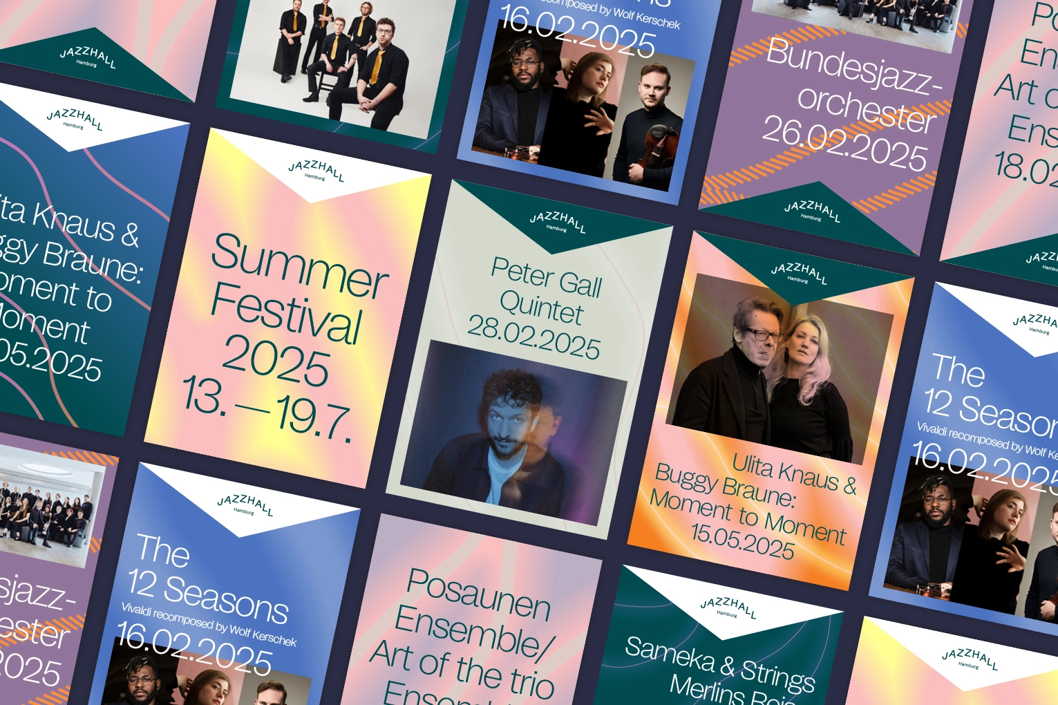
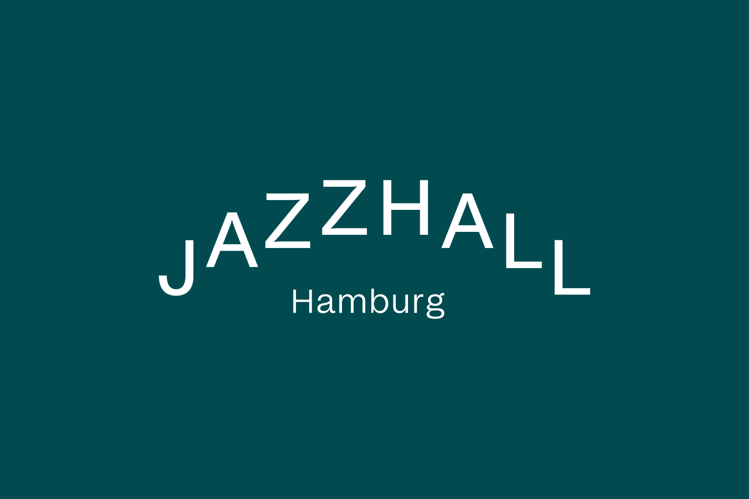

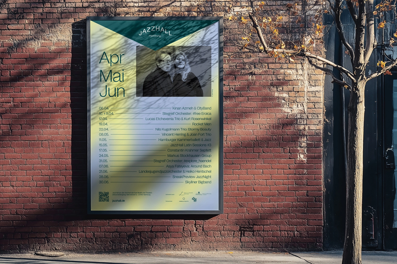

JazzHall Hamburg
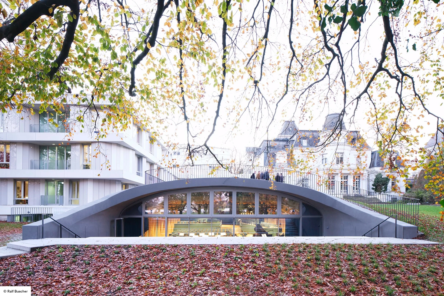
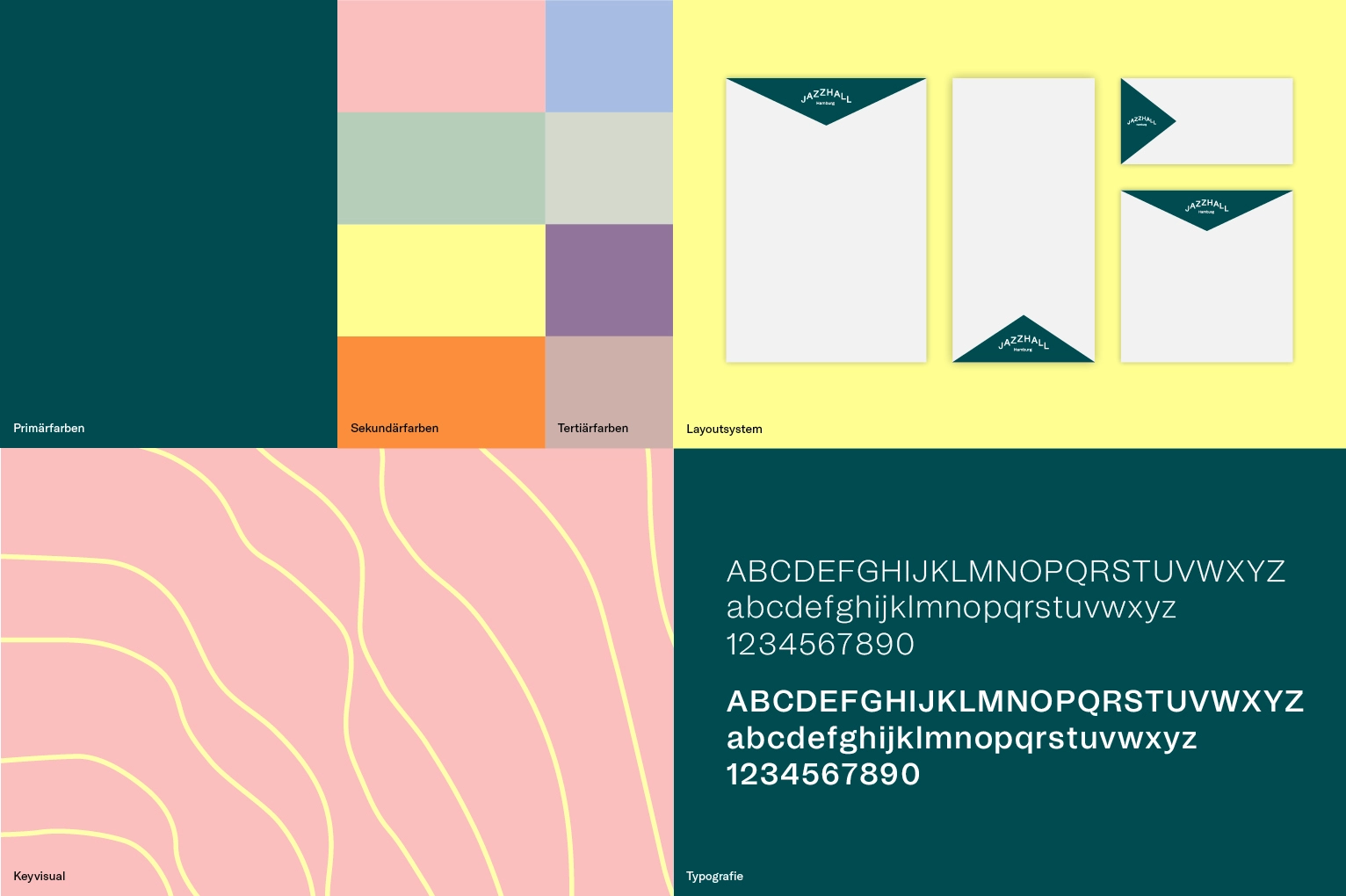
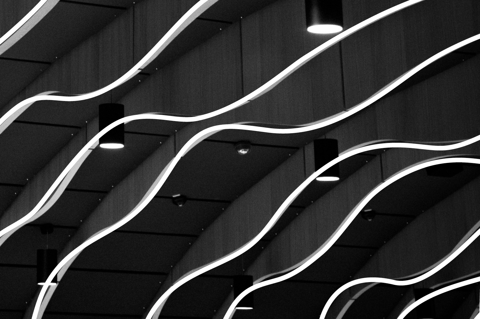
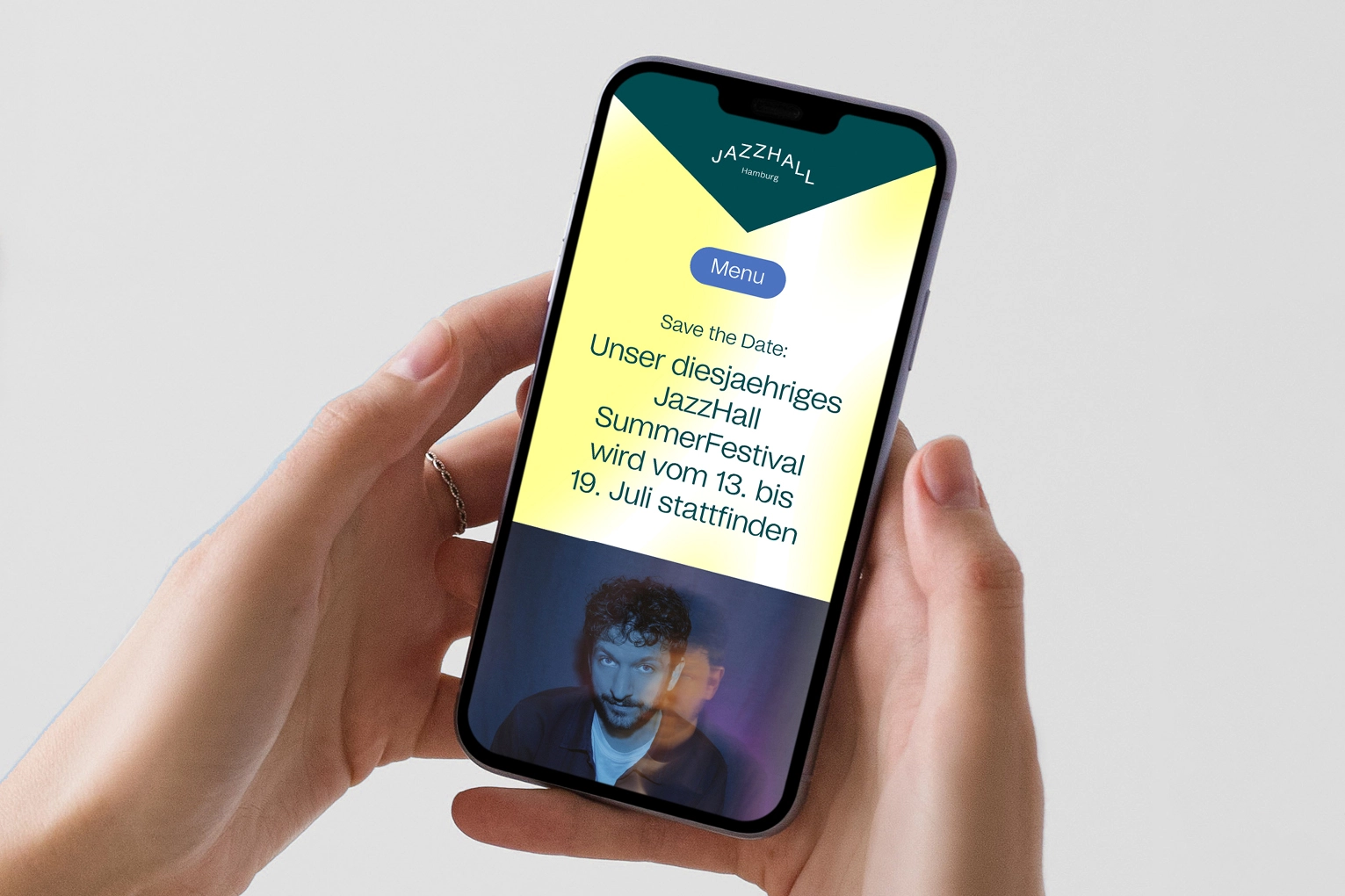
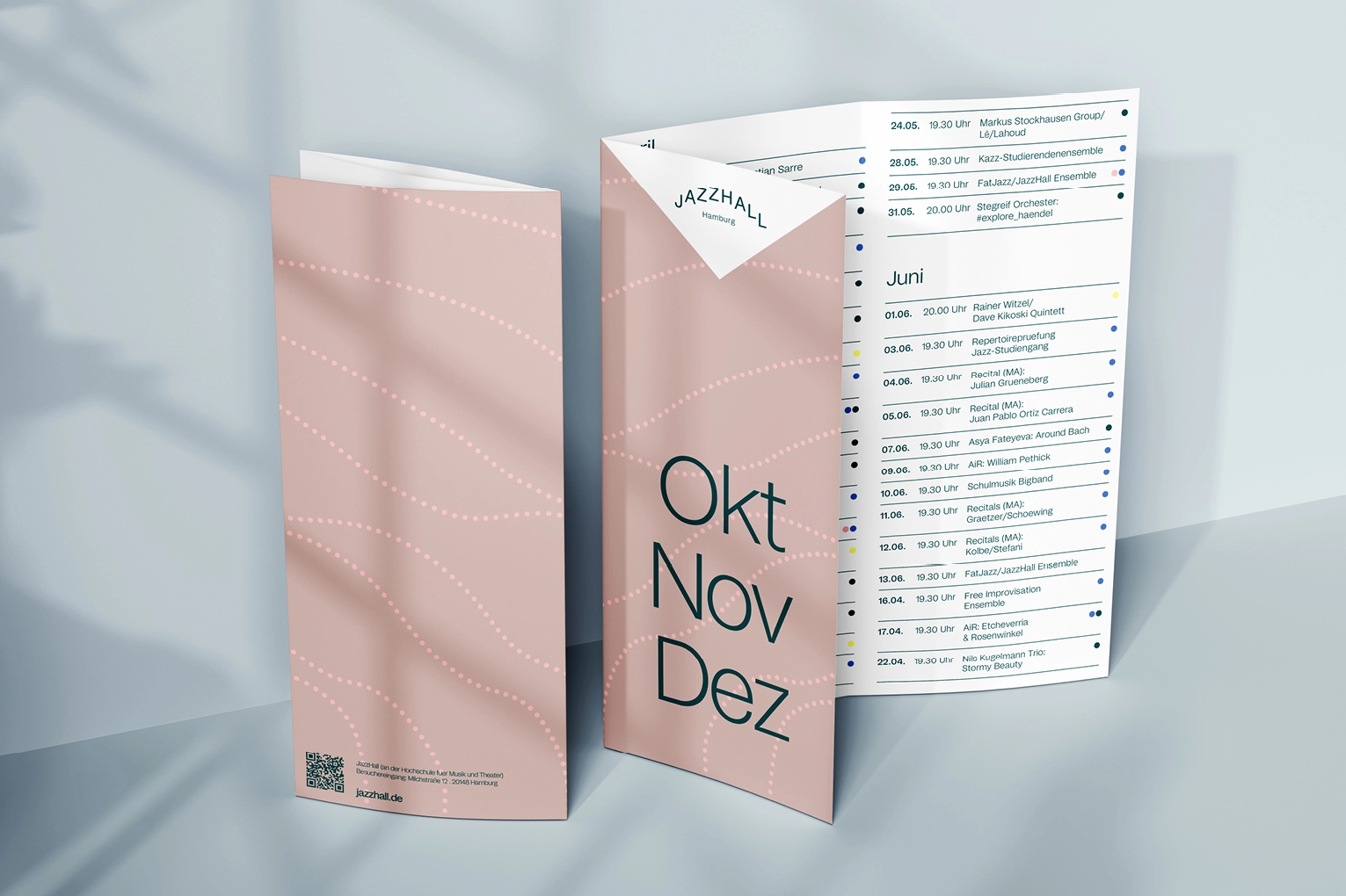
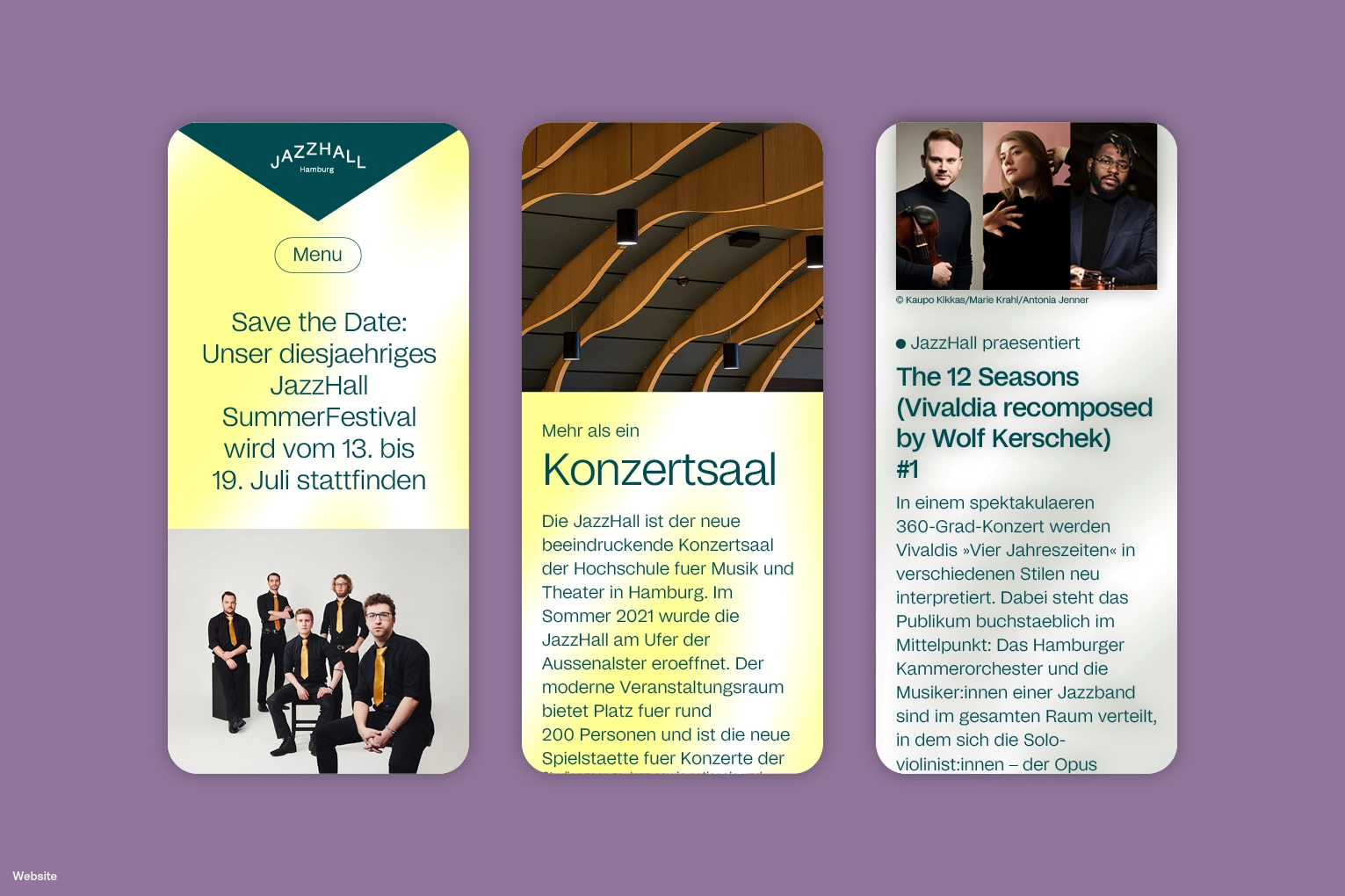
JazzHall Hamburg is not only a place that brings jazz out of its niche, but also a space for encounters – with musicians, with other people, and with oneself. It embodies social values such as respect, diversity, exchange, and community in a very practical way. The logo design visualizes this togetherness and at the same time abstracts the architecture of the JazzHall. Characteristic elements such as the striking slats – inspired by the building’s design – appear as graphic waves in all media: sometimes soft, sometimes clear, sometimes bright, sometimes subtle. In this way, they bring the diversity of the program and of life to life.