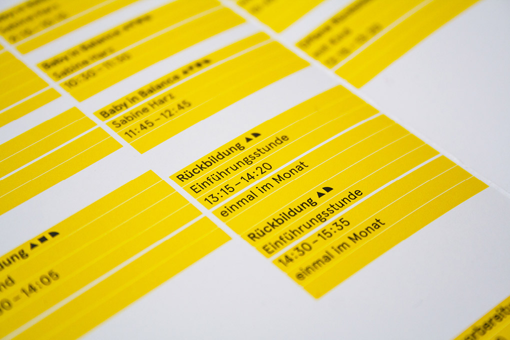
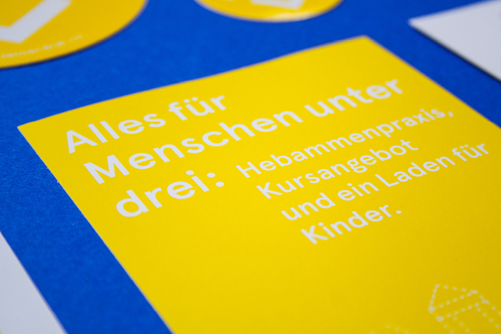
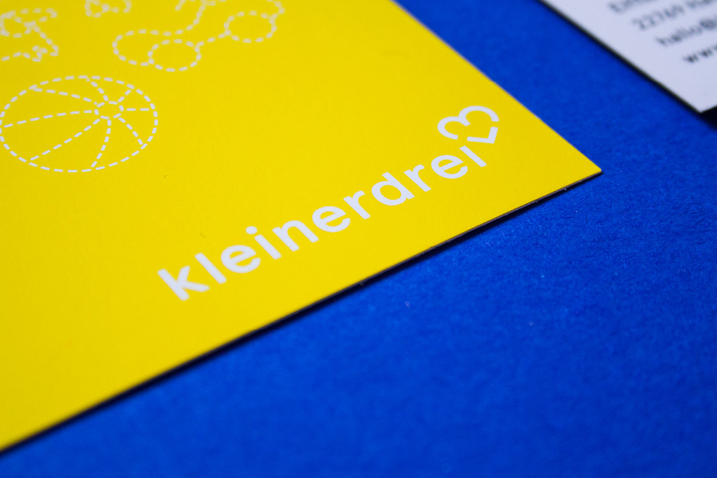
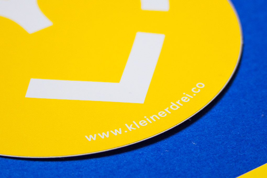
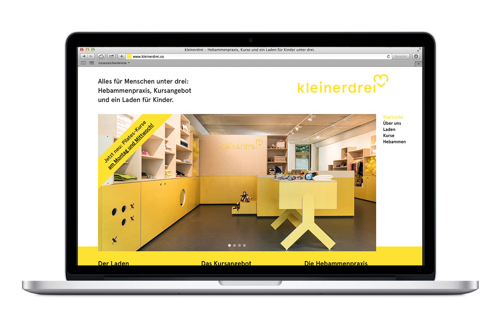
Good design is clear, concise and tangible. Through my design, your content becomes visible, accessible and comprehensible. Thanks to the finely tuned tonality, they reach the viewer not only cognitively, but also emotionally. And thus anchor themselves in the long term and sustainably.

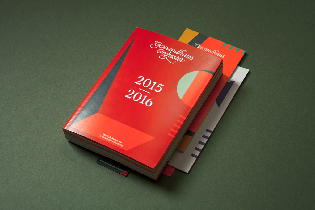
Gewandhaus Orchester
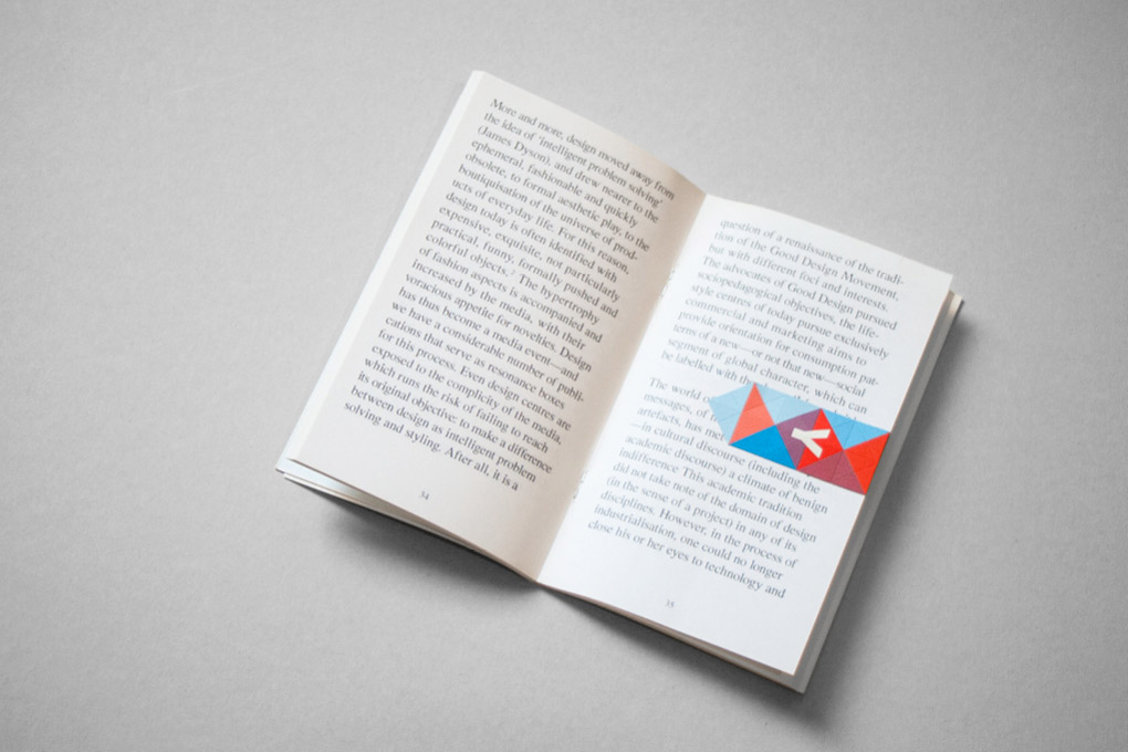
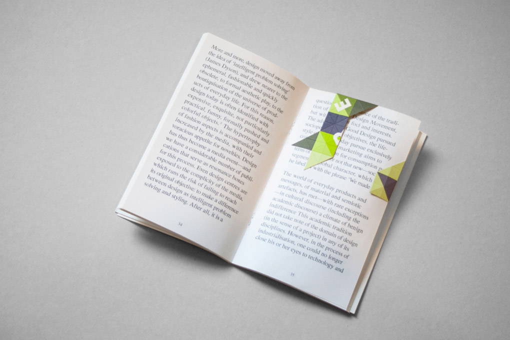
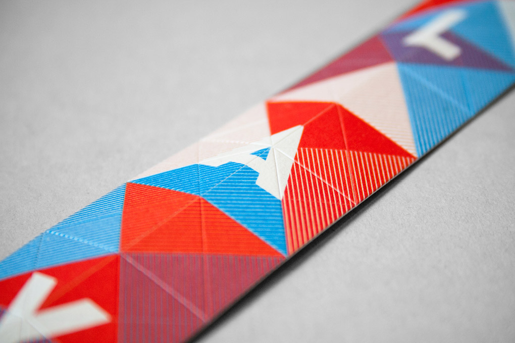
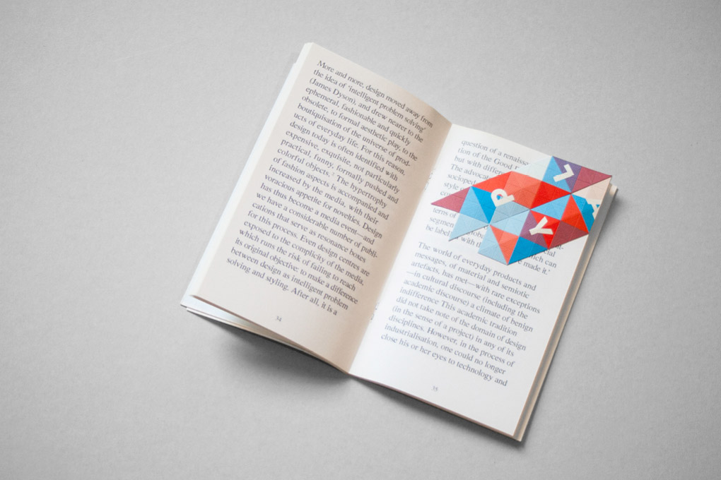
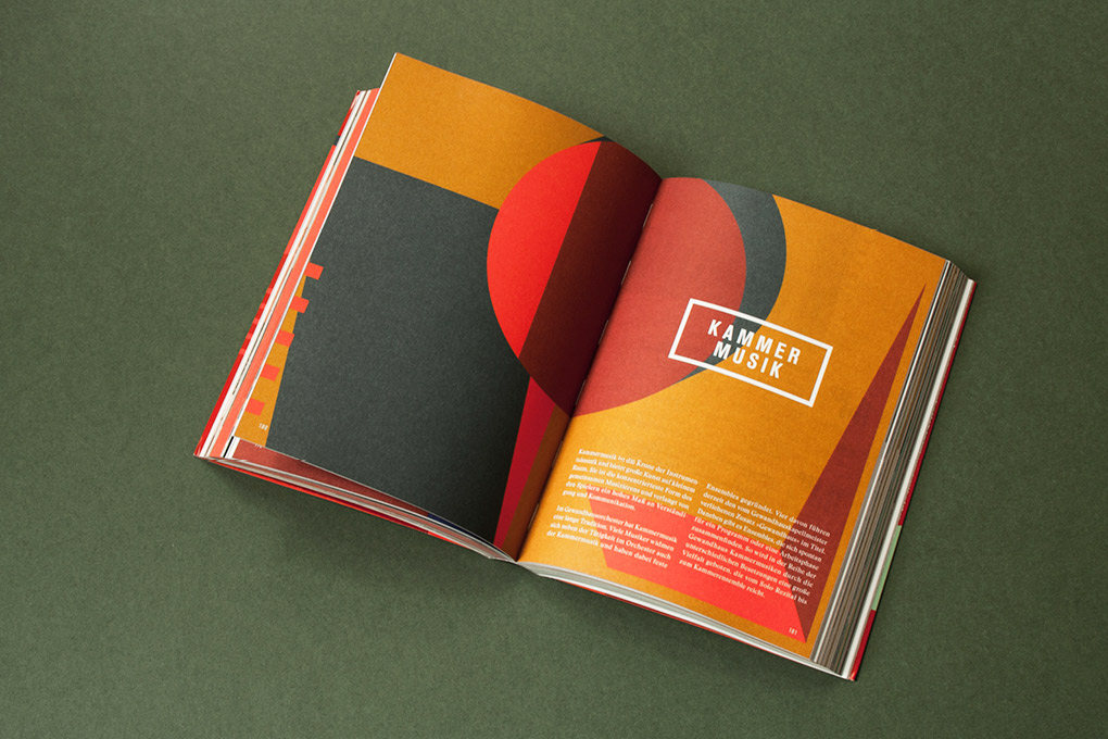
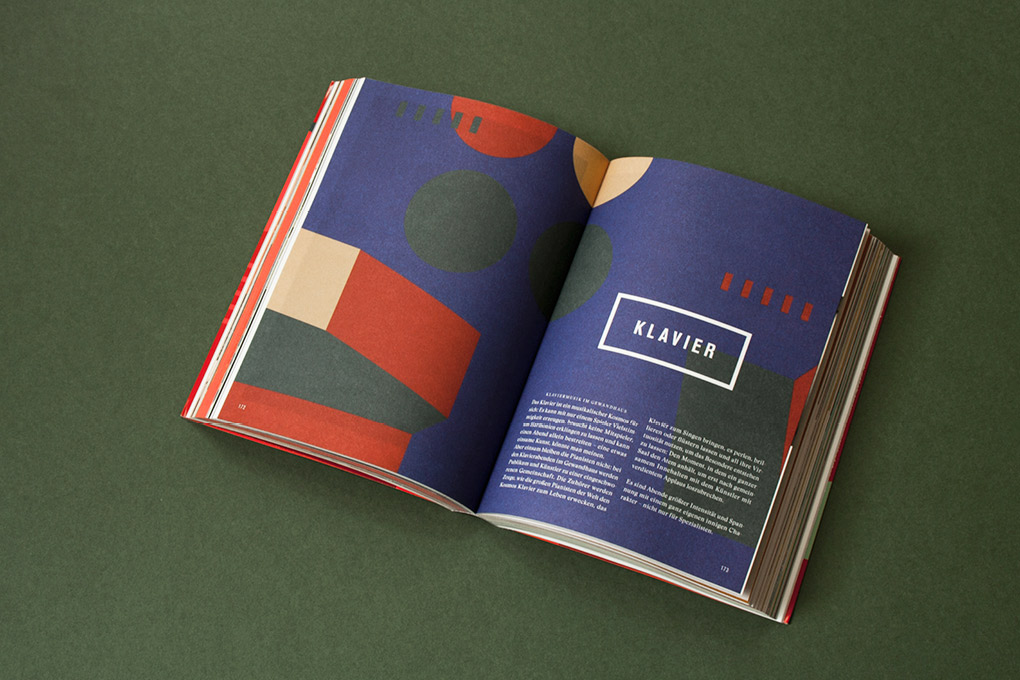
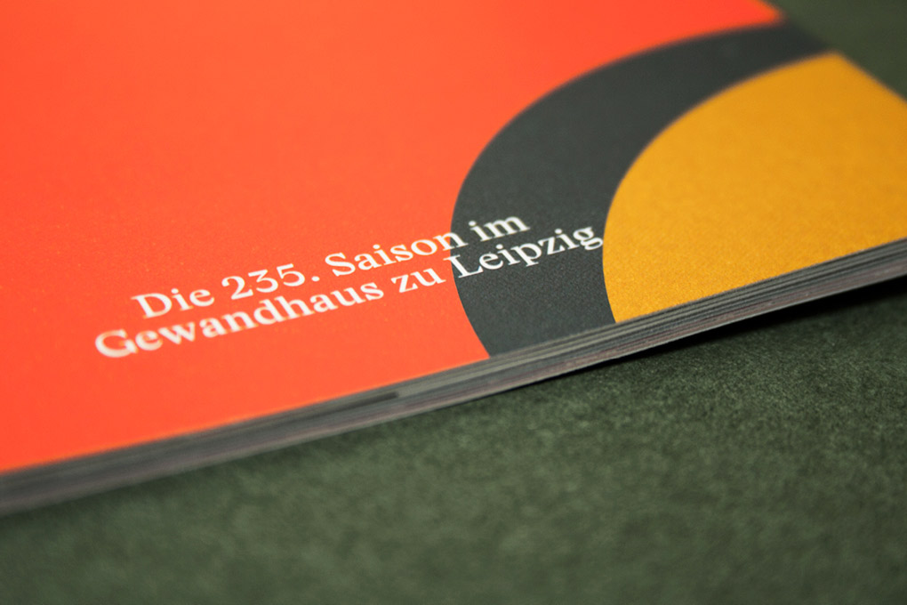
The Gewandhaus Orchester is one of the biggest and oldest symphonic orchestras in the world. If you visit Leipzig you won’t miss it – because of its brutal architecture. The distinctive forms were the starting point for the design and are now visible in their reduced abstraction in every medium. Strong colours fill them with life – as the music fills the building with colourful sounds.