Good design is clear, concise and tangible. Through my design, your content becomes visible, accessible and comprehensible. Thanks to the finely tuned tonality, they reach the viewer not only cognitively, but also emotionally. And thus anchor themselves in the long term and sustainably. Tell me about your project.

carolinrauen_philosophiedessingens_1 carolinrauen_philosophiedessingens_3 carolinrauen_philosophiedessingens_4 carolinrauen_philosophiedessingens_5 carolinrauen_philosophiedessingens_6 carolinrauen_philosophiedessingens_7 carolinrauen_philosophiedessingens_8 carolinrauen_philosophiedessingens_9 carolinrauen_philosophiedessingens_10 carolinrauen_philosophiedessingens_11 carolinrauen_philosophiedessingens_12 carolinrauen_philosophiedessingens_13 carolinrauen_philosophiedessingens_14 carolinrauen_philosophiedessingens_15

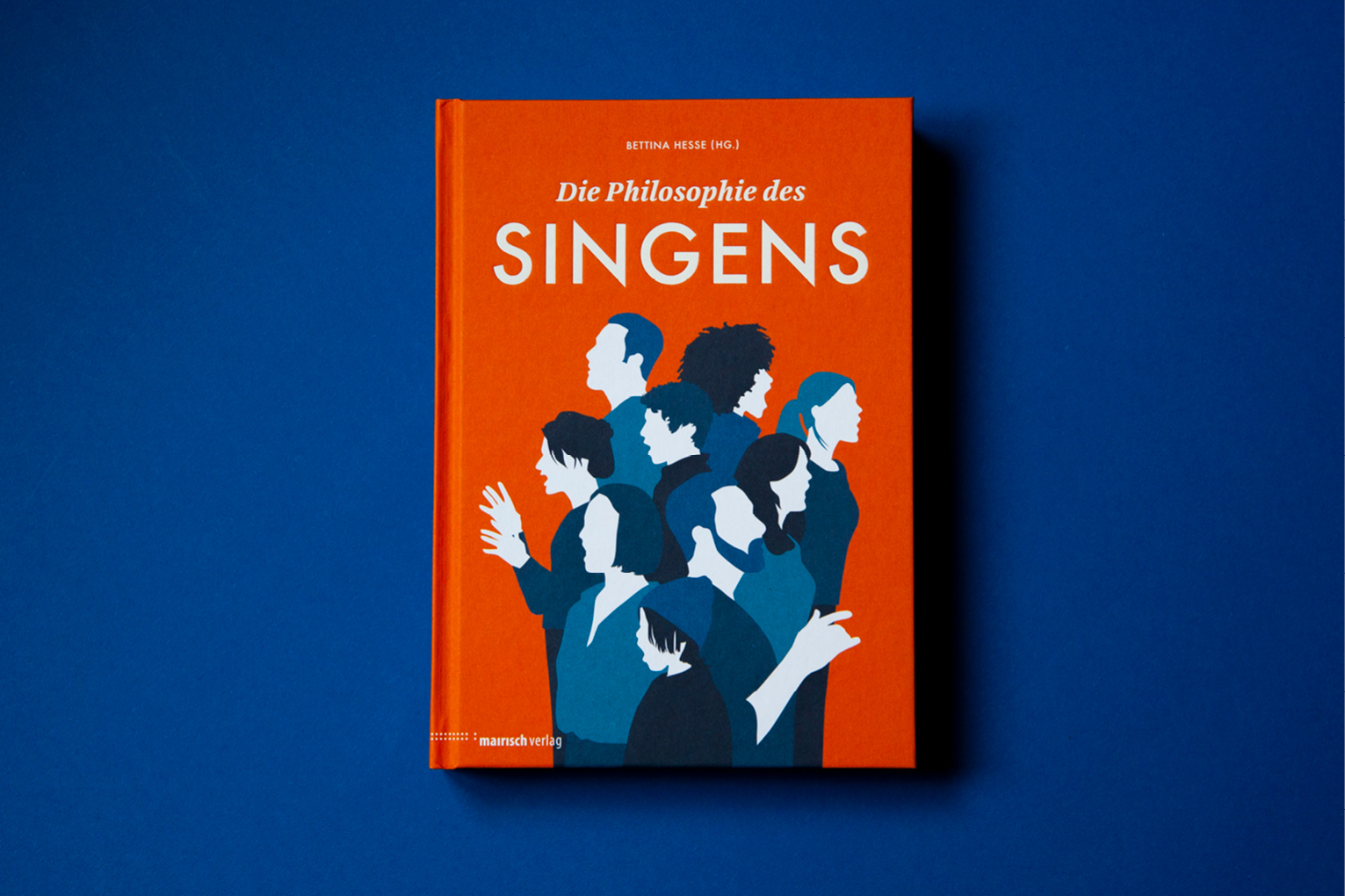
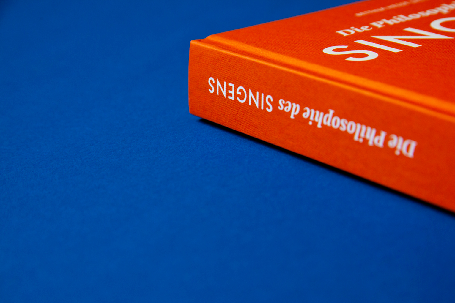
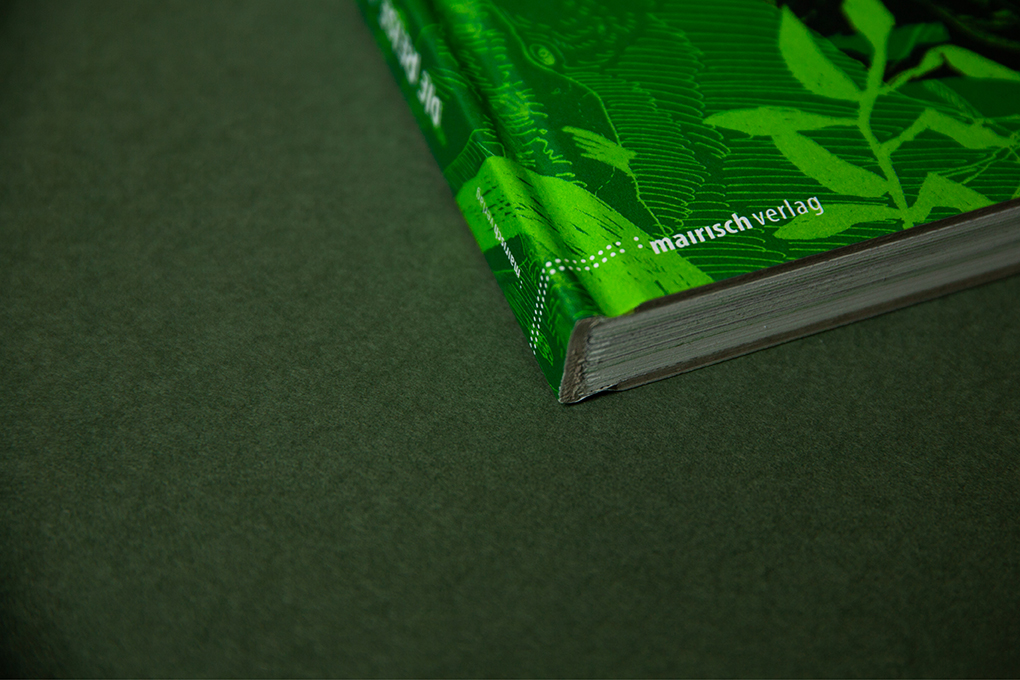
Die Philosophie des Singens

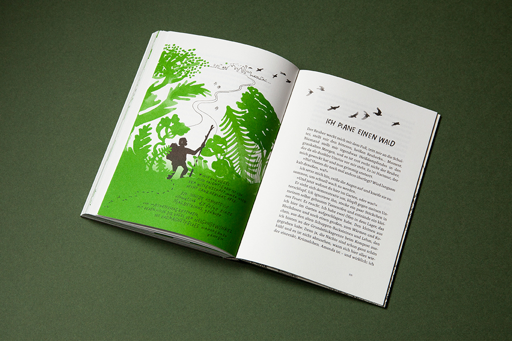
What is singing anyway? Is it an artistic act? What do expression, mirror of the soul or a political act mean? How do animals sing? Is it a difference to sing together or alone in the shower? – 21 authors write about philosophical, poetic and practical aspects of a cultural technique that is always part of our natural expression. The cover shows the togetherness and at the same time the individuality that is hidden behind the singing of each one.

for mairisch Verlag
book design, illustration
154 × 215 mm, 272 pages
offset printing, hot foil stamping
2019

carolinrauen_efp_1 carolinrauen_efp_2 carolinrauen_efp_3 carolinrauen_efp_4 carolinrauen_efp_5 carolinrauen_efp_6 carolinrauen_efp_7

European Film Promotion

After 20 years of constant growth, it is time for European Film Promotion to take advantage of the high level of brand awareness and present a more uniform image. The new strategy focuses on strong visibility to successfully promote European films at international festivals. This works with very bright colors, a striking typeface and a clear arrangement of geometric shapes and images. The color palette allows for an almost infinite number of combinations and designs, and all types of images can be inserted.

carolinrauen_reuber_01 carolinrauen_reuber_05 carolinrauen_reuber_06 carolinrauen_reuber_07 carolinrauen_reuber_08 carolinrauen_reuber_09 carolinrauen_reuber_011 carolinrauen_reuber_012 carolinrauen_reuber_013 carolinrauen_reuber_018 carolinrauen_reuber_020 carolinrauen_reuber_021 carolinrauen_reuber_022 carolinrauen_reuber_025 carolinrauen_reuber_027 carolinrauen_reuber_028 carolinrauen_reuber_029 carolinrauen_reuber_030

Die Reise zum Mittelpunkt des Waldes

How do you become a good father? The protagonist wants to learn from the best and makes his way to the forest to find „Reuber“. The result is a beautifully illustrated and written homage to the courage and the forest by Rán Flygenring (illustration) and Finn-Ole Heinrich (text). In the typography, hand-drawn elements complement each other with calm classic typesetting. The workmanship also has a major effect: the trimmed edges of the hardcover transform the overall object not into a coffee table, but into a workbook.

for mairisch Verlag
book design
150 × 210 mm
offset printing, hot foil stamping, stiffened paper cover
2018

Die schönsten deutschen Bücher 2019 – Winner

carolinrauen_karinrocke_lookbook201920_1 carolinrauen_karinrocke_lookbook201920_7 carolinrauen_karinrocke_lookbook201920_8

Karin Rocke: Lookbook 2019/20

“Urban Calm” – the fall/winter collection 2019/20 of Karin Rocke – strives for beauty in reduction: Architectural proportions, a combination of at most two colors, best merino wool and mohair, made in Germany. An uncoated paper transfers the soft surface to the print product, straight lines create order and space for every piece of the collection to shine.

carolinrauen_ziegel#16_4 carolinrauen_ziegel#16_6 carolinrauen_ziegel#16_7 carolinrauen_ziegel#16_8 carolinrauen_ziegel#16_9 carolinrauen_ziegel#16_10 carolinrauen_ziegel#16_11 carolinrauen_ziegel#16_12 carolinrauen_ziegel#16_13 carolinrauen_ziegel#16_14 carolinrauen_ziegel#16_15 carolinrauen_ziegel#16_17 carolinrauen_ziegel#16_16 carolinrauen_ziegel#16_19 carolinrauen_ziegel#16_18 carolinrauen_ziegel#16_20

Ziegel #16

A large shiny field of orange-red metallic hot foil reflects the light. Inside, bold, almost tapering letters form the word “brick”. Above, an angry, panting wolf. The first edition of the newly designed Hamburg yearbook for literature brings together poetry and fiction by almost fifty Hamburg authors as well as illustrations by Line Hoven. The book – whether cover or spine – attracts attention and makes you curious to look inside and lose yourself in the various texts.

for mairisch Verlag
book design
155 × 215 mm
hard cover, offset printing, metallic hot foil stamping
2019